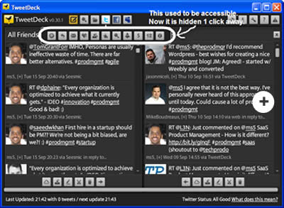
An hour ago, I did something without much conscious thought at all. I uninstalled the Twitter client I used to like (Tweetdeck), and installed a new one (Seesmic). And there I went, merrily tweeting.
Then, I caught myself and started thinking why I did that. The more I thought, the more I realized that there are a few valuable lessons in it for all of us who are involved in building software or products in general.
Here is my story, followed by the lessons…
Computer Crash Nightmare
So this Saturday my trusty old laptop (XP) died. Just went belly up. Gone. RIP.
Luckily I had all my data backed up in two different places. And they both worked – to my pleasant, pleasant surprise! 🙂
Still, I had to install every software all over again in my new laptop. One of those software is Tweetdeck – a desktop Twitter client that I’ve always liked.
When I downloaded it, I realized I’d been using Tweetdeck from several versions ago in my old laptop.
I was a little concerned, because software makers often tend to bloat up their software in every new release – to the point of driving users mad.
Sure enough, when I installed the new version I was in for a surprise. Not the “good” kind.
Goodbye Tweetdeck, Hello Seesmic!
Tweetdeck used to be a Twitter client. A damn good one too. It seems like they now want their software to be a client for not just Twitter – but also for Facebook, MySpace, etc, etc. Fair enough.
But in the process of doing so – they took all my favorite buttons and hid them one level removed from the first screen.This meant that for almost every action I frequently took – now there’s one extra click.
One, measly extra click! No big deal, right?
Well, apparently my picky subconscious didn’t think so – it promptly uninstalled Tweetdeck and installed Seesmic. Before I even consciously realized what it had done! 🙂
Well, in its defense – it looked for an option to disable all those new social network thingies I never use – but it couldn’t find those options in Tweetdeck. May be they exist, may be they don’t. The net result was – goodbye Tweetdeck.
The funny thing is – the Seesmic client also covers Facebook, MySpace, etc in addition to Twitter. But they do so in a manner that doesn’t get in my way and force me to suffer through an extra click – when all I want to do is tweet.
Lessons for Those of Us in Product Management
Here are some important lessons for those of us in product management:
- Remember Your Current Users
- When building a new release with shiny whiz-bang features, keep your current users in mind too. Don’t ruin their experience.
- Please remember – often, a bird in hand is worth two in the bush.
- Give Users Option to Keep Simpler Interface
- When adding new features that complicate the interface, give users the option to stay with the simpler interface if they prefer.
- We did this for our own software (a SaaS requirements management tool), many months ago. To our surprise, a good percentage of our customers stay with the simpler interface – in spite of the extra goodies in the more complex interface.
- Keep the Basic Users in Mind – Not Just the Expert Users
- Often, there is an urge to design for the advanced, “expert” users. Especially since they tend to be louder & these features seem more cool.
- Resist the urge. Most software should be optimized for the “Typical, Competent” user (i.e. the 80%), not the “Expert” user (i.e. the 20%).
Editor’s Note:
Interested in an affordable, enterprise-quality software to help you manage requirements in a better way? Check out FREE 30-Day trial of Accompa or Sign Up for a Demo.
 Follow
 Email
Email


 3) Do not read this blog one sentence per day during your lunch break, while eating a