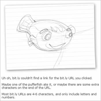
User-Friendly Error Messages – A Good Example

One of my pet peeves with most software is the cryptic, unfriendly error messages thrown up by so many of them.

At Accompa, we try to make error messages in our own software as friendly and useful as possible. I think we still have a long way to go, but we work hard at it.

I just saw the following error message from bit.ly – the URL shortening service used on sites like Twitter. On most websites, this is usually a cryptic “404 Error” message. See how bit.ly has made it so friendly and fun! 🙂

Click for larger image

Michael Shrivathsan

I'm your author, Michael Shrivathsan, an expert in product management with successful experience at several innovative companies in Silicon Valley, USA over the past two decades. I'm also a USPTO patent recipient. For my day job, I'm the VP of Product Management at Accompa, we make the popular requirements management software used by Product Management, Business Analysis, and related teams.

More Posts - Twitter - LinkedIn

FREE Goodies! Yum…

Like This Post? Get More by Email
Get new posts like this delivered right to your inbox - for FREE...

(We value your privacy)
FREE White Paper
7 Tips for Better Requirements Management. Based on a survey of over 100 companies...
Get it now »
Requirements Tool for Your Team
Want to improve the way your team manages requirements? Accompa can help. Check out product tour -or- request FREE trial »